Once you've designed and scrapped your pages, print them out and cut to perfection. I'd recommend a standard to light weight paper for the insert. Especially if you are going to have a lot of pages. You might want to consider picture placement and how your pages will look once folded and in the book.
Saturday, May 3, 2025
Free Summer Travel Suitcase Mini Scrapbook Album with Step By Step Tutorial for International Scrapbooking Day
Once you've designed and scrapped your pages, print them out and cut to perfection. I'd recommend a standard to light weight paper for the insert. Especially if you are going to have a lot of pages. You might want to consider picture placement and how your pages will look once folded and in the book.
Tuesday, March 25, 2025
Free Digital Scrapbooking Template, Free Scrapbooking Kit and Full Instructions on How to Digital Scrapbook
A very warm welcome, crafters and page artists.
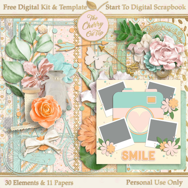
Click the image or above link to get to the awesome blog and download this free digital collection of papers, elements and sticker sheet.
Step 6) Start sliding in your elements and moving them around the page with your mouse and the left click.
Step 7) When you've got your elements where you want them, consider adding shadows. It really gives your page dimension and looks totally awesome. It's a great way to add lift and contrast, too. Check the bottom, right of the tool bar and selects "effects" or "styles" depending on your version of the software.
Step 8) Move your design exactly where you want. (Mine was a little too low. The easiest way was to "Select All Layers” at the top toolbar, deselect the paper layers by left clicking on the them, as shown in the layers bar in the below image and then left click and move the entire grouping to your desired location.)
Step 9) Go to the left toolbar and click on the color picker and choose a color from your layout that will work for your title. I went with the bluish color.
Step 10) Also in the left tool bar is a big green "T". There you will pick a font that matches the style of your page.
We definitely have a kind of whimsical style going on for our page. So a whimsical font, will be perfect.
Now, you could stop there, but if you want to keep working, follow along and learn a few more cool tricks.
Step 11) Slide a paper over your font layer and left click, clipping mask to clip it to your font. This will give texture and it'll match your page perfectly as well.
We're going to take another step further.
Step 12) Add a stroke to your title by going to the Effects menu and choosing "strokes". Left click on the one you like best.
By default, you'll get a black stroke, but that can be changed easily. The black really does not go well with our soft pastels. If there were more black introduced it might.
Step 13). Go over to the layers bar and quickly double click the tiny fx symbol on the layer you wish to add a stroke, which would be the font layer. This extra menu will pop up. Left click on the black box.
Yet another box will pop up. I hope I've not lost you so far! Now is your chance to color pick the exact color you want for your outline or stroke.
Step 14) Choose your stroke color and click ok. Make sure the stroke is the size you like. You can still change it by sliding left or right. Hit ok when it's perfect.
Step 15) Consider adding a shadow under your text. You can click right in the same menu box as the stroke. It's closer to the top. You can also see how you can easily make adjustments by sliding left and right on all three shadow options, which are size, distance and opacity. We'll be talking a lot about shadows in future blogs.
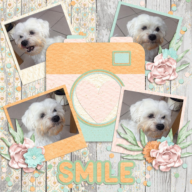
You could finish there. I went and added a big layer of paint over my background and clipped in the coordinating pink paper so it all matches. I love using anchoring elements like confetti, scatter, splatter, stamps and paints to anchor my elements and photos to the page.
It's a great way to add more interest, color and or contrast to your pages.
So, how did you do? Easy, right? If you found it difficult, don't give up. It may take a few go's until the process gets smoother. I did change out just a few elements and added a few more awesome ones. You’ll love the changes!
I've got a lengthy video where I hold your hand and we digital scrapbook together. There's even another free kit and template for you! Our YouTube channel is full of all kinds of digital scrapbooking tutorials.
Wednesday, June 27, 2012
A Free Template for a Mini Paper Purse Scrapbook An Easy Fun Project for Kids and Adults
You start off with this white, template. (I can scan it for you and send it via e-mail or Facebook and then you have to enlarge it.) or you can just free draw it. There are three patterns. The hour glass shape, the page and the flap. All three are here in white. Trace over them in the colors you like. I kept my book fairly rigid and made it with good card stock, but I used cheaper paper for the inserts and adhered them back to back.
The bright, green card stock is the basis of the book. I chose a matching, bright, girly patterned paper for the inserts and to decorate the outside of the purse. I used both double sided tape and glue. Typically, I use double sided tape around the outside and then glue in the middle if I'm using stronger paper such as card stock.
No worries if your pages are not perfect, but I do line them all up and snip a little here and there to see that they are approximately the same size.
Use a hole punch to make three small holes in the crease outlined by the black dotted line on the pattern. You can use eyelets or in this case, brads.
I used three large brads. It gave a little more freedom when it came to the depth I needed for my inserts. This picture is an excellent illustration of where you need to score your inside pages.
My first page is one heck of an opener! I just love it. Many of these papers used in the book are from a 6x6 book I bought at a discount store and because the inserts are so small it gave quite some left overs and that was a big part of my embellishing technique.
Keep in mind as you are designing your book that some pages are going to be upside down when in the book. It took me a bit to figure that one out. This top page with the pink ribbon and flowers was supposed to be the bottom of the page (in my deranged mind), but after applying it properly, it turned out on the top. I thought it still looked great. So, I didn't make any changes. Go with the flow.
Gems and ribbons are just screaming, "GIRL!" I did use a lot of them throughout this book. When coordinating how I was going to set up the pages, I kept in mind, the next page. So that when the pages are back to back and the book is opened, the book coordinates. Like you see to the left. A little strip of the top page paper is on the bottom page. Each page is softened by ribbon.
Another little strip from the two previous pages is applied here. A little injection of that bright green is sporadically used throughout the book to continue the coherence. The flowers on the top page were from one of those confetti sets and I just used my smallest hole punch for the centers. Some flowers were doubled up and some were doubled up with paper punch flowers.
The fabric flowers on the bottom page adds more warmth and texture which contradicts the cooler silver frame giving a little obvious contrast. Soft and warm with fabric and cool and hard with metal or metallic.
My latest craze are pearls. They just add that perfect touch of elegance. I received these pearl strands at a workshop. It was a small container full! I hope I will be able to find them somewhere when I run out. There's that touch of green again. This time coupled up with some cute buttons in coordinating colors and a lace look that brings a bit of old to a more modern style.
This little frame was a synch to make. The 6x6 pattered paper was just this grid of cuteness. I cut a square out of the middle that fit on my page. Some sequins here and there for more glitz, a cute little butterfly and a big, blingy flower makes a serious statement.
This is the last page. However, I would suggest not decorating the last page and adhering it to the basis of the book. Oopsy...there are some upside down hearts here. I thought the page was really cool and had some very interesting aspects, but the book would be much better if you glue down this last page.
You may have to cut your flap a little bit smaller to fit like this on your cut out.
Here is how I chose to close my book. If you use a bit heavier embellishments it may automatically hold down your flap. You could use magnets, velcro, a clasp, ribbon, a tiny Glue Dot...there are many options for you to choose.
I don't know about you, but embellishing is my favorite part of scrapbooking. This cover was really fun. Here is what I used: A large circle, a large flower, then a smaller one, then a brad and then a tiny hole punch from super, blingy, glitter paper. Which is just what those tiny, pink, circles are with even tinier silver dots layered up. My trusty Elmer's Craft Glue pen and some Glue Dots to adhere.
Of course, you could use a larger piece of paper to cover the back as well. I thought the green was really great and eye catching. So, I left most of it exposed.
Ah! It's really coming into shape, but what's missing? The handle or strap can be made in many ways. You could use a small, light, chain, ribbon, wire...The possibilities are endless. That's one of the great things about this book. There are just so many options. Styles, textures, colors, themes, they are are all limitless with this project.
Here is an inside look at the brads as well as how I fastened the ribbon of the handle to the inside of the book. A simple knot is all it took. Keep in mind of the limited amount of space in this crease to not only fasten your pages, but your strap as well.
I was a bit surprised how fast the strap came along. Thread one end of the ribbon through a small hole in the top of the purse (and eyelet if you choose) then tie a small knot. Then go up a couple of inches, tie another knot and then begin adding your beads. I made a fixed pattern because I'm a kind of symmetric freak. When you have the amount of beads you want, tie another knot. Thread the other end of the ribbon through the hole in the top of the purse, tie the last knot and voila! I used enough beads to measure the width of a typical, feminine hand.
Here is how I covered up the brad pins from the big flower embellishment on the flap. I could have used a flower, but I felt like I used enough of those already and chose another shape that was repeated in the project. TIP: Where it's appropriate, I put a flower over the back of the brad pins and if the pins are colored then you turn the brad and fix the flowers so the the two pins look like petals from the flower.
Add some metal elements and charms for even more excitement.