Tuesday, June 7, 2016

Step By Step Boys and Dinos Scrapbooking Page Layout with The Cherry On Top

Welcome to The Cherry's traditional scrap Tuesdays.

I whipped up this layout in under two hours, with the stash I had from various products that are probably even fairly dated. I wanted to show a step by step process on how a basic multi photo layout is composed. Consider aesthetic, balance, layers, color, paper and embellishments before you begin and throughout the process.

Follow along the step by step photos to see how it's done. I have no fancy tools. Some different kinds of basic adhesives, scissors, paper cutter and you're set.


First, I gathered up some really fun photos that I took of the boys a few years ago. All of the photos are from the same event and have awesome consistency with each other because of that. This also helps with the aesthetic of your layout.


The next step is to choose some goodies from your existing stash. Consider what your photos are of. In this case, young boys. Also consider the colors in your photos.  My favorite!  A basic, red, blue and yellow.

Notice my optimal organizing system?  Hehehe...I've been scrapping for nearly two decades and still just throw it all in a bag. I'm not saying this is a good system. I'm lazy and would rather be scrapping than organizing.  It's a little organized according to category, boys.


Take a peek at what I chose from my stash. I want you to notice color, the kind of elements (suitable for young boys and with the colors from the photos) and also notice there is nothing fancy here. Most of this is just inexpensive sticker sheets and one card stock with some critters and flowers, that I didn't end up using, but could have.


My other bag of scraps. Abominable, eh? I do go through this every 5 years or so. Hehehe...I love pulling out colors from the elements and the pictures so it will give an overall coherent look.


See what I grabbed? The papers mirror the embellishments in color, youth, fun and vivacity.


We've got all of our goodies together, which can be rather time consuming. That's what makes collections so awesome. In a good collection you don't have to search for these things and they surely will match, even if you don't recognize it.

Consider how you want to position your photos on the page. Do you have to crop? Will you ditch the white border, if there is one? Are you going to add extra layers for color, depth and dimension?


I got a bit lucky with my photos. Note two long photos and two rectangle photos. This is really ideal for a super balanced layout. It doesn't get easier than this. Above I positioned them. I could have cropped the photos a bit, but I quite liked the white trim and wanted to keep it.


I love layers. Nothing says quality, time and caring like layers. It's also an excellent way to introduce color, contrast color and or bring your layout all together.

I scrapped up a couple of banners with the scrap that matches my layered frames to reintroduce these colors.  I'm an eye baller.  I just lay my cut out on top of the next paper to cut, to get an idea where to cut.


Go from the corner of your rectangle to the centre and then on the other side to form a triangle like this.


There we go!  Notice the alternating colors and how the banners of the photo are the opposite of the mat? This is how you create balance in your layouts. (I didn't end up using these.)
  

This is how I don't organize my alphas and lettering.  Throw them in a drawer!  Hehehe...


I went for these larger chipboard letters I bought at a discount store. As cheap as I am, I'm not a fan of inferior adhesive. Paper and stickers don't really seem to matter, but adhesives are a whole other ball game. Go with the good stuff if you can. These letters were not great quality. The adhesive doesn't stick at all. The paper backing was very difficult to get off without ruining the letter and the letters were damaged rather easily, too. Still! Better than paying a fortune if you haven't got it, which I don't. I also do not have a cutting machine.


To keep a balanced look, I grabbed all of the letters I needed in different colors that were in the photos until I could come up with the perfect color combination for two words. Yellow, light blue, red, dark blue and orange. It looks much better than say, with two red letters next to each other. If that's all you have, than so be it.


A tip I often give is to use different kinds of adhesives. Check this out. On my photo you see one long strip of double sided tape as well as glue. There reason for this is two fold. One, if one adhesive gives out over time, you have back up. So, you don't have to re glue your page. Two, if you use only double sided tape, you have to get it right the first time. With the added glue, you have room to play as long as you don't push down on your tape. I love being able to nudge and adjust until I have it positioned perfectly.


This is actually a card stock paper of 12x12 with a fun design. I'm cutting out the images that match my palette and using them as embellishments. I do this all of the time. Think of cards you receive, mail, magazine images...it all works.


Here's another handy idea for you. I want to put this flower behind the photo. That means you'll only be seeing a portion of the flower. I only have one flower anyway, so I'm cutting this one in two. I also do not want to introduce yet another color into the palette. Covering the pink will make the layout look much better.


Let's quickly review what we've done so far.

-We layered up our photos with coordinating colors from the pictures.
-We positioned the layered photos nicely in the centre of the page leaving a blank frame/the background that is about the same the entire way around. Look closely. There is about 1/2 and inch the entire way around the background paper and also note how far apart each picture is from the other. Just about the same, about 1/4 of an inch. This helps tremendously with balance.
-We have not adhered our matted photos yet! We are placing around our embellishments, first.
-We've placed our flowers behind our photos. Look how many there are, three. Three is the magic number when it comes to balance. It brings your balance even further. Odd numbers are usually recommended as well when composing a piece or layout.
-I've placed long flowers in the long pictures being sure not to cover any important part of the photos and used more squatty elements on the wider photos.
-All of the colors are coordinating. Don't stray from your palette if you want to stay on the safe side.


Here's another tip for you. I wasn't sure how these dinos were going to fit on my layout because the backing is not clear. I cut them out and placed them where I thought they might look before pulling the sticker off. It's a bit of extra work, but if you want to be sure...


This dino is terrible here! The colors are great, but the size is all wrong. The dino is just about as long and wide as the blue flower. Not good. We want to mix and match in our clusters.


I have not glued anything down at this point. I'm playing with the elements trying to figure out which to put where. Look at the top right cluster. I chose a shorter, wider dino to contrast the long, tall flower behind it. The roundness of the orange flower is also contrasting the other elements. This gives the cluster balance.

Top right, coordinating orange flower, blue dino, slightly smaller and the green flower. All very different on their own, but still matching everything on the layout so far.

Bottom left, long tall, red dino, orange flower, small, round, green flower on top. All the same colors in the layout, but different from each other.  This adds interest.

Bottom right, long tall flower, squatty dino.


Still not gluing! Playing with the letters this time. Observe the placement. Varied yet coordinating colors and when you position them like this, you don't have to worry about keeping them on a straight line AND you save a lot of space. This was really ideal to save space and because the word itself is "fun", why not place the letters in a fun pattern.


Since we are putting the half flowers behind our photos, it is important to remember to NOT adhere where they need to go. I place adhesive all around my mat except where the flower needs to be tucked.


Position it just the way you like. Stay on your background paper.


There is our first cluster all glued into place and with a few added grass stickers. FIVE elements in this cluster. Remember odd numbers. This isn't always the case, but often.


Next cluster, all set and glued in. I added more grass to mimic the other cluster and this bright orange flower centre from my alphas.


What fun?! Hehehe...the lettering is a part of the cluster. The "N" is not perfect. I just added a gem over the blemish because there were tiny gems on some of the stickers and I wanted a touch of something else scattered over the page anyway.


That's it! All finished! A fun, basic layout and the boys can't stop touching it. Hehehe...They think it is really, really fun and liked the memory of the wash baskets.  I wish they were always this enthusiastic over my layouts! Hehehe...


I hope you could get a few tips and pointers from today's blog. I'll be back on Thursday for a Throwback of a previous free template you may have missed. On Freebie Friday, I'll have June's planner pages and Saturday, I have a teacher appreciation, free printable.

See you then!

I would love to see what you are scrapping and you can show off your digital and or traditional layouts in our new group on Facebook. We share tips, free stuff, ooh and aah over each other's work, play games and all kinds of fun stuff.  

Happy scrapping!

Saturday, June 4, 2016

Hybrid Saturday with LissyKay Designs and a Free, Printable Card

Welcome to The Cherry On Top's hybrid Saturday.

I've got a bit of a special blog, today.  I'm showing off some awesome templates from lissykay designs along with some fabulous digital designs from your favourite designers.  I've got a bit of a tutorial on changing up your templates to customise your needs.  I've got an alternative idea on how to use digital templates and I have a free printable card for you, too. 

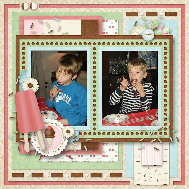
How sweet is this layout?  My boys devouring ice cream cake for JJ's birthday.  This Banana Split  kit from Kim Cameron is totally awesome!  I'll be using it again and again, for sure.  There are so, so many great ice cream related embellishments and of course some standard staples as well.

A template like this one from lisskay designs, is a fantastic way to show off multiple papers and layer, layer, layer.  Layers add depth and dimension to your pages either traditionally scrapped or digitally.  If you feel like your layout looks flat, consider layers and if you're doing it digital style, then add some shadows for even more depth.

 free template

This template is actually FREE.  Click on the image below to find out how to get it.

 free template

Here is another really fun template from lissykay designs.  I teamed it up with Colour Your World from LouCee Creations.  Another favourite kit of mine.  So bright, bold and whimsy fun.  It speaks to me.  Hehehe...

That's my cutie, Liam.  Both of my boys really love colouring, drawing and creating. 


Here is a glimpse of the templates in the set.  Absolutely terrific, right?!

 templates

This template is part of store wide collaboration at GoDigitalScrapbooking.  I used it to scrap up yet another birthday.  This time for Liam.  He asked for a strawberry pie and my husband baked it for him.  How dreamy, eh?  Liam was very pleased and oma and opa dove right in.


This is what the template looks like.  If you love it, like I do, click on the preview to get it.

Here is a look at another free template from lissykay.  I know, right?!

 free template

I want to show you how I changed it up and turned it into a printable card for my mom's birthday.  Take a good look at the above, original image of the template.  Notice the changes?  I got rid of the small squares at the bottom, the four dashes and the dotted frame.  I also didn't put tiny clusters on either side and I changed the location of the title.  I then, slightly enlarged the layers and centered them.


One other change was leaving off the white grid shape.  I wanted these neat ribbons to be a focal point and give my layout a soft, textured feel.  I also expanded the corner cluster to reach nearly the entire length and width of the frame for added drama.

That's me and my mom and thought it would be fitting for her card.


I always like to make my printables as versatile as possible so more people can enjoy them.  I'm sure you know the perfect recipient for this card.  Right click to download and make sure you adjust it so that it is the perfect size you need.


Here are a few suggestions.  I used an international size format, changed the image direction and placed it all of the way to the right.  I recommend printing on either glossy or rigid paper to give your card some stability.  If you use this format, print fold and cut and you'll have a standard card.  This one is 5x5.


You could also print it like this and your card will open at the bottom rather than the side.  The choice is yours.


I hope you enjoyed today's printable and all of this inspiration.  We've got more templates, inspiration, hybrids, printables and a ton of free stuff throughout the blog.  Grab a cup'a jo and scroll through.

If you really like what you see, consider joining our Facebook Group where scrappy sisters show off their digital AND traditional scraps and projects.  I offer all kinds of exclusive freebies and promotions there as well as tips, tricks and tutorials to improve your craft.  I'd love to have you join us.

Here are some other hybrids you missed.

This lovely card and mini accordion album using Paty Greif Digital Designer goodies.

 accordion hybrid

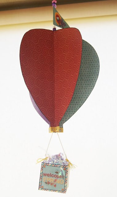
This really easy and fun air balloon using that same great kit from LouCee Creations.

 hot air balloon

These fast and simple paper pinwheels.

 pinwheel


Thanks for making The Cherry a part of your day!


SaveSaveSaveSave

Friday, June 3, 2016

Freebie Friday With MagsGraphics

Welcome to Freebie Friday at The Cherry On Top.

You are going to love today's blog!  It is full of kicking inspiration, fabulous kits and collections and some serious freebies.  Keep reading to see all of the lovely goodies we have for you.

MagsGraphics has so much going on right now, my head is spinning.  Yes, worse than usual.  Hehehe...Maggie's got a new guest spot at GingerScraps on top of FIVE new kits and collections.  Isn't that just crazy?  She's been working her tushie off!  Let's jump on in and take a look at all of this loveliness and download some sweet freebies.

Dance In The Rain is a bright, fun kit not just for drippy pictures.  Look how I scrapped up my King Silly with a rainy day kit.  Pull out the generic embellishments and you are ready for any kind of picture.

 Dance IN The Rain

Here's another great one, Adventure Land paired up with a template from AKD.  What a bunch of cuties.  Going to that theme park was not at all easy for JJ, but once we were inside for awhile, he ended up enjoying it.  Yay!  He even got on the big ferris wheel.  I stayed on the ground and prayed the entire time they were up there!  Hehehe...

 Adventureland


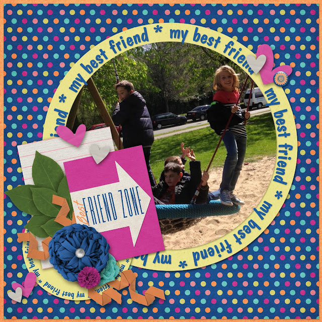
I've got two layouts with this collection, Life Long Friends.  I took all of the soft pretty colours for one layout and used these dashing, bright and bold colours for my boys layout.


 Life Long Friends

These are my lovely nieces and this is a template from Made By Keuntje.  Pretty unique, eh?!


 Life Long Friends


This is a template from Brenian Deisgns that will be releasing June 17th.  She's got some great templates that you can check out in the mean time.  Click here to see more from Bren.

Summer Breeze is another kit from MagsGraphics and these colours are just fab.  I'd love to say this layout took me ages, but thanks to the ease of Bren's template and such a pretty kit, it was whipped up in under 20 minutes.  17 to be exact.  Hehehe...Am I a dork or what?!  I'm kind of a time freak.


 Summer Breeze

I'll leave you with yet another fabulous collection, Scouts Honour.  It is boy and girl scouts friendly.  She really has covered it all.  I designed this project life style template with a twist.  I liked the idea of blocking up the photo spots.  How about you?  Keep reading to get the link for this free template.

 Scouts Honour

How about an awesome, coordinating template?  Click on the preview for the link.

 free template

Find this free, coordinating freebie on Maggie's blog, by clicking on the preview.

 Maggie's blog

Maggie also has this free template in the Ginger Scraps forum.

 free template

How happy are you with today's blog?!  Two awesome templates, a mini kit and some serious inspiration to get you well on your scrappy way.  Give us a shout out, like, share, + or Pin as a way to say thanks.

All of our freebies are always for Personal Use Only.  If you are interested in Commercial Use, contact us here or via our Facebook Page.

Today is going to be awesome!  Thanks so much for helping with that.

Happy scrapping!


Thursday, June 2, 2016

Throw Back Thursday with Aimee Harrison and Tips on How to Scrap Fast

Welcome to The Cherry's, Throw Back Thursday.

I've got some lovely scrappy inspiration from Aimee Harrison, tips on how to scrap fast and links to some awesome products and freebies.

I suppose I can't throw back too much further than this.  I believe that's me, pictured with my mom and her glorious hair and my dad before he got a beer belly.  Hehehe...


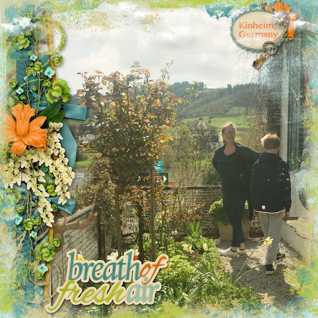
Fresh Air from Aimee Harrison is totally that.  Such a sweet, refreshing, natural feel to this collection.  I actually feel a bit of shame with this layout.  I put it together in under 10 minutes and I really love it.

Collections are a super way to scrap fast.  Who doesn't have 10 minutes to spare?  No excuses, now!  Hehehe...Let me explain how to scrap fast when using collections.

Look carefully at this layout.  There are a total of 11 pieces I used including the photo and the text.  That's it!  No wonder it goes so quickly.

Here are the 6 steps:

-On the very top layer are the clouds, copied and pasted.
-The second layer, from the top, is the awesome grungy border frame.  I love those!
-The third layer is the gorgeous border cluster on the left and main feature, next to the photo.
-The word art is part of the collection.  So, I only had to slide it in there.
-The tag is as is with the exception of the lettering.  I backed it up with the orange flower, white flower and the key.
-Add your picture and save!

That is how you scrap fast!  Many designers provide borders, clusters, word art and stacked papers that make scrapping simple and speedy.  So, if you don't scrap because you don't have time, this is an awesome alternative.

This picture was taken in Germany, last month.  We were looking at houses there.  This one had a lovely view of the Mosel River from the front of the house.

Fresh Air

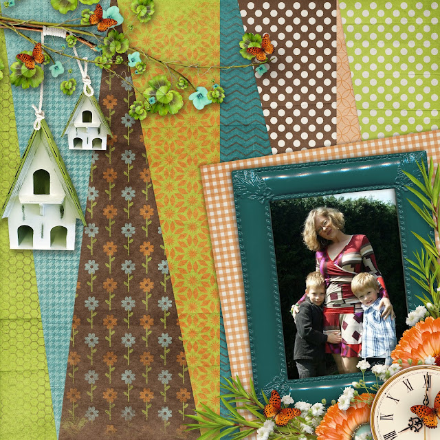
This layout uses a template from Brenian Designs and Aimee's collection.  You can get a better idea of what's in it and see the lovely papers in action.  What a super template to show off this beautiful collection.  It will be released on June 10th.  Click here to see Bren's current templates.

That's me and my lovely sons.  My little guy is actually smiling for the camera!  A rare moment, indeed.


 fresh air

Here's a look at those fabulous borders in the collection. Put it down the middle, choose a side, top or bottom for placement.

 Fresh Air

These are all of the parts in Fresh Air.  That is a lot of goodies!


 Fresh Air

These are the stamps and the border frames or edges I used.  They are really super!


 Fresh Air

Pop over to Aimee's blog and check out more of her designs and grab some freebies while you are there.

Here's a sweet freebie from The Cherry and Aimee.  Enjoy!  It is for personal use ONLY.

 free quick page

Tomorrow, I'll have a free template for you!  See you then.


Thanks so much for checking out The Cherry.

Join our new Facebook Group to show off your crafty projects, get some serious inspiration, enjoy exclusive freebies and have a laugh with the lovely members.