Welcome to The Cherry On Top.
Have you heard the great news? I'm selling my templates in GingerScraps, again. The shop was always left open so that those thousands of links I had out wouldn't take viewers to a dead link. Ginger is such a sweetheart for letting me do that and for letting me sell my templates in her shop, again. If you know me, you know she has to put up with all of my antics, too. What a star!? Hehehe...
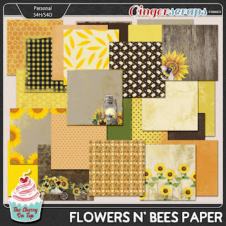
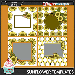
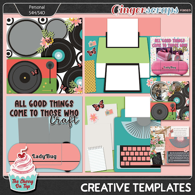
You know me, crafters! I wanted to open the shop with a celebration of new, incredibly creative templates and other design goodies. I've got 11 items in the GingerScraps shop that are new to GingerScraps. Some are NEW NEW and some just new to GingerScraps. So, check your stash before you buy.
Let's get into these new goodies in GS, peruse gorgeous page inspiration from the team and get a few tips and tricks along the way.
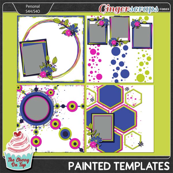
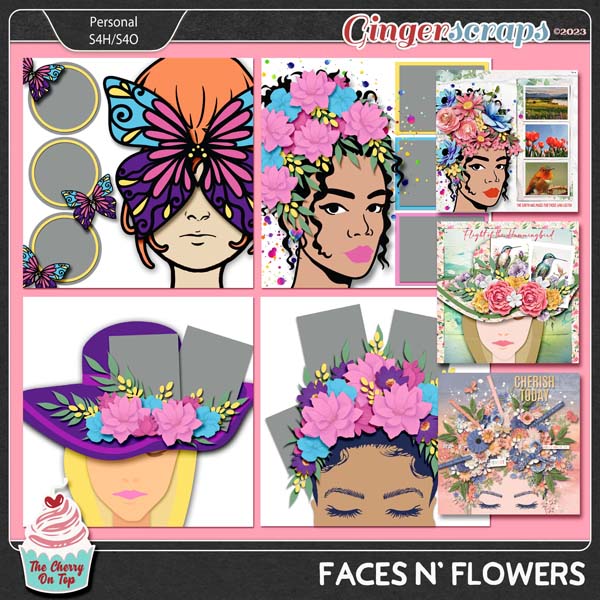
My team seemed to love these new, new templates. If you do, too then you should also check out my Awesome Edges templates. I went with that artistic vibe and used the elements from them for these templates.

A fantastic kit or collection will make any scrapbook layout, gorgeous.
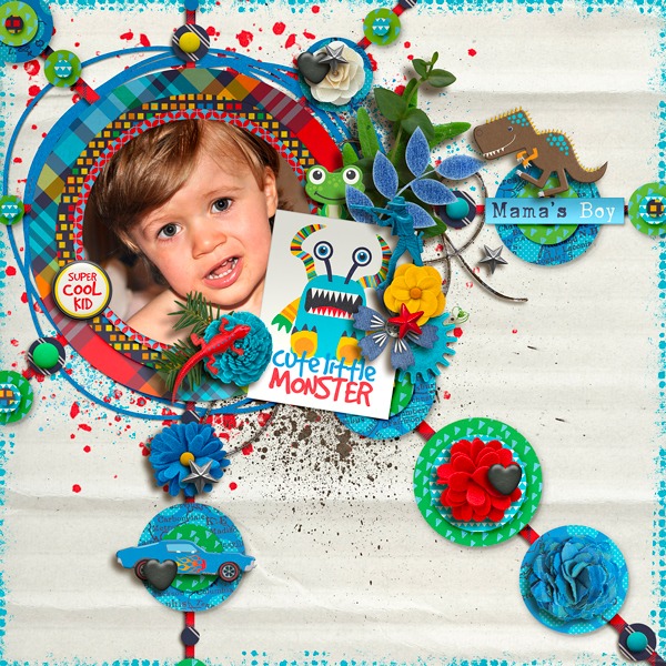
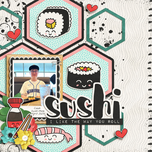
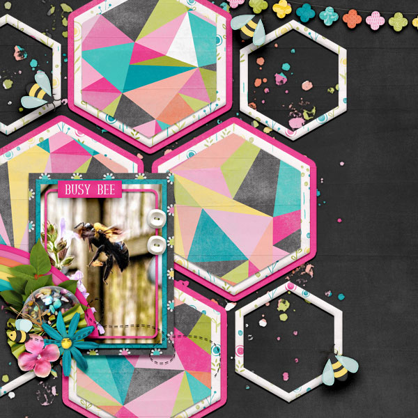
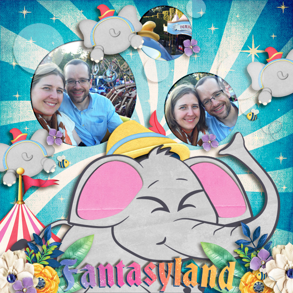
Pairing up a template with a kit isn't always easy. Kim's page is a great example how to do it well. She used a super fun and quirky digital scrapbooking kit with a modern, edgy template.
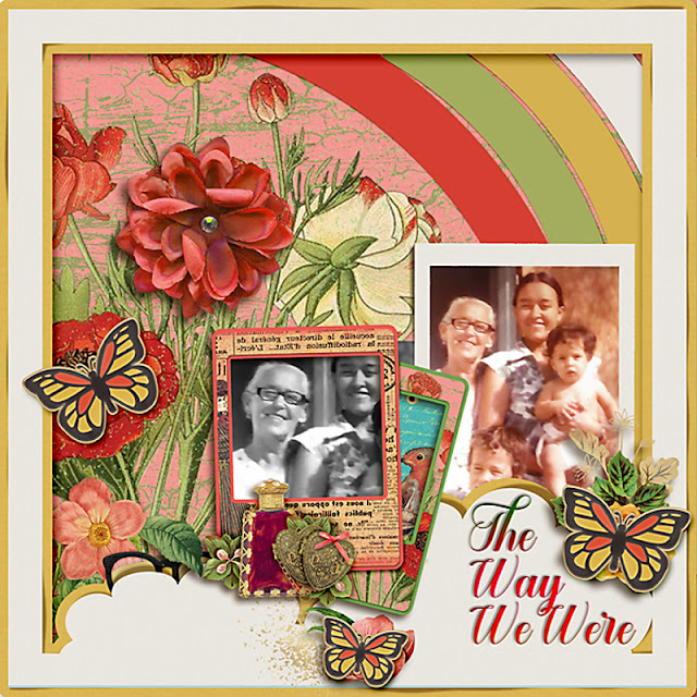
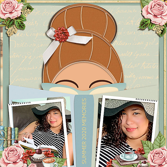
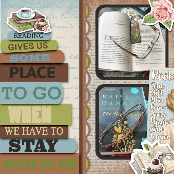
Kate mixes her goodies so well with my templates. She did a bit of old meets new. The colors are modern. The temple has a modern vibe and she coupled that with a vintage photo. There's a touch of vintage in her elements, too. All of these qualities lend to the cohesiveness of her page.
Hilary went all modern. The colors are super fresh and fun, too.
Michal usually does wonderfully modern pages and she's a pro with colors. Matching photo colors with your digital goodies always make a more visually appealing scrapbook layout.
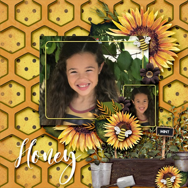
Take that tip I just gave you and check out Evelyn's page. Perfection! If it's tough getting those colors just right, pull out just a few colors from your digital goodies. Here's yellow, black, white and a splash of green for pop. Brilliant!
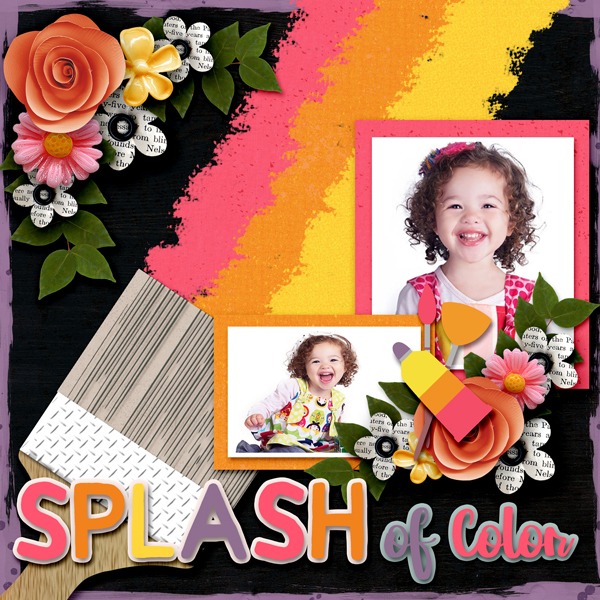
Black is an awesome way to give your pages a modern look. Pair up black with bright colors for a fresh vibe.
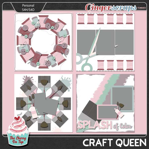
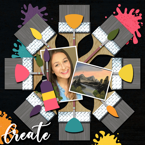
I saw an image on Pinterest where someone took old paintbrushes and turned them into a stunning wreath. What a super idea! I saw a lot of beautiful sewing wreaths, too.
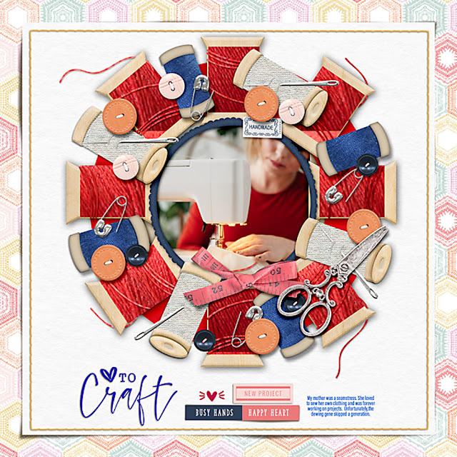
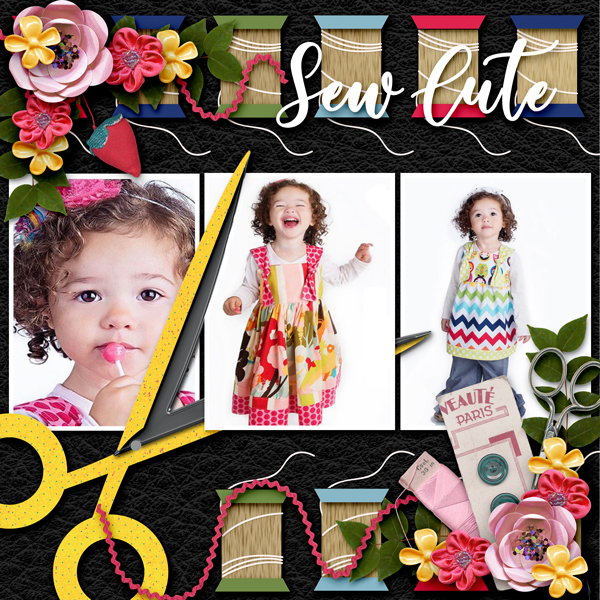
How brilliant is Kate's page?! I love the way she used that fabulous thread texture for the sewing spools. This is exactly the kind of page I pictured with this template.
Evelyn is knocking her pages out of the park! She even used all Cherry kits for her pages. I've linked them all up. Pretty great if you want to lift her pages. Cool how she did the wood paper over the spools, too. Are you getting all kinds of ideas, now?
The title is really fun and the colors totally grab your attention because of the black background. If you look carefully, you'll see she didn't use that many elements, but blew them up nicely and changed the colors of some of the elements from the template to finish off her page. All great digital scrapbooking skills.
Craft Fair Collection from The Cherry On Top
I've provided so many elements on the template that you don't even have to add your own. Easy, right? We don't all have hours and hours to scrapbook a page layout, right? Look closely again, at Eve's page. See the same hues in the pictures? See how she color picked the green from the green on the painting and sprinkled it all around her page? A matching green blob, a green brush...this evens out the color balance making her page look awesome. Yours will too when you use these tips.

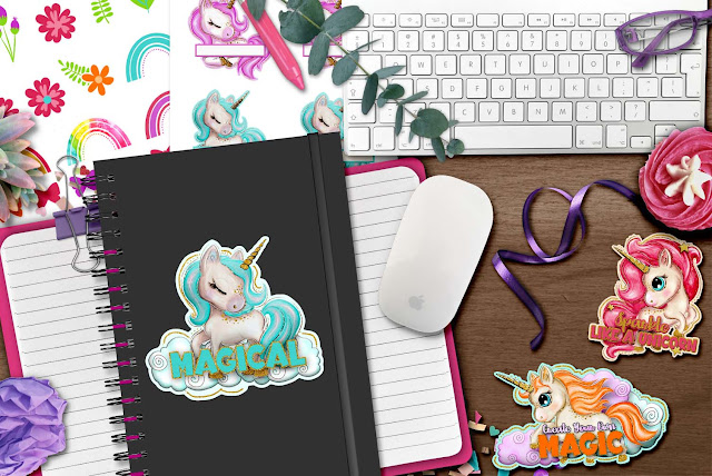
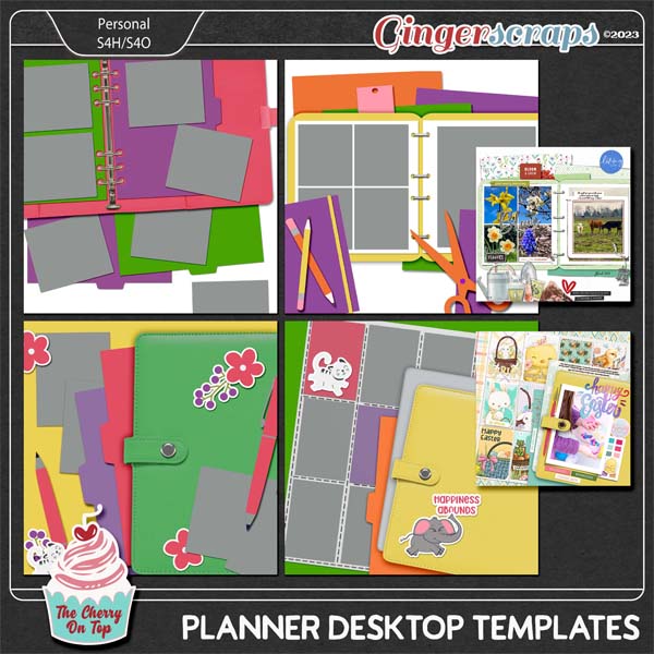
I am sadly abysmal at knowing what my fans love. Isn't that so sad?! Hehehe...After all of these years, I should know better, but alas...I really love these desktop style templates and I was so uber pleased to see that they top my "Popular" category at GingerScraps. Finally! I often design something thinking my fans are going to love this only to have the opposite occur and vise versa. I think I'm cheating by designing such a super simple template, quickly and it's a big hit! Hehehe...
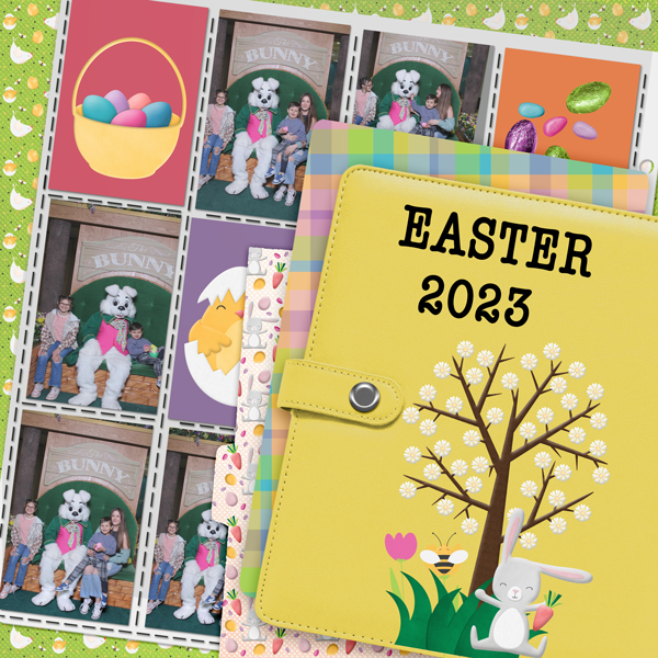
If you want a more realistic look for the notebooks and planner, use a puffy style or action. In PS and PSE it's called a Bevel. Adjust it to perfection for just the right look.
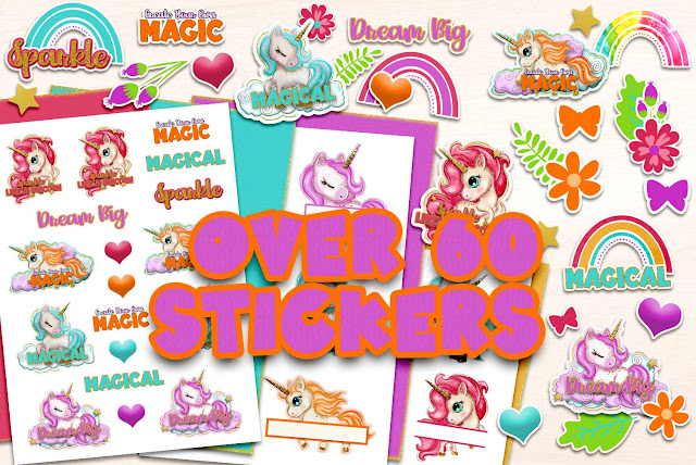
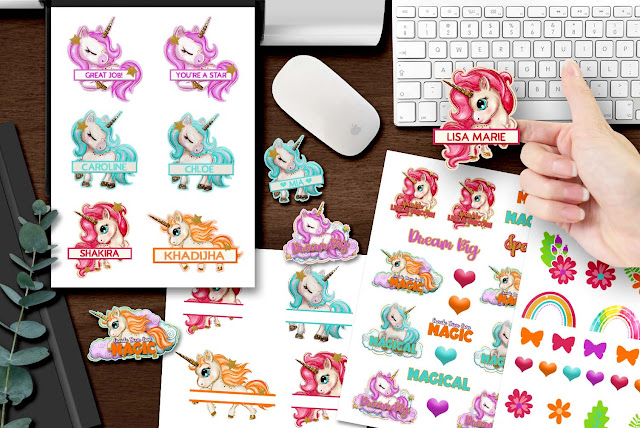
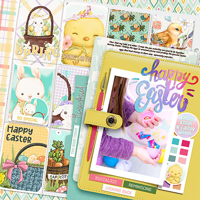
What do ya think of my Spring Stickers? I actually sold a few of these. If you were part of that, thanks! I really appreciate your support.
I left the template with a realistic metal binder. I love this idea!!! I don't know about you, but I am not great at playing and tweaking metal styles. I think Eve's notebook looks so realistic thanks to the texture paper she used and the shadows.
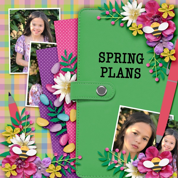
I did it, again! I kept a realistic looking planner on the template. This will make your page layouts look incredibly real. Use the color picker and adjust that color to perfection. Don't forget to "clip" those layers onto your planner only. Maybe this video will help.
I loved Evelyn's idea of using my Yearbook Collection for her two pages. They look fantastic! My little design papers are so darn cute! It took me a few minutes to figure out it was my kit. Hehehe...

These are templates from Kreative Design Studio. Check your stash!
The ladies made stunning pages!!!
Are you applying some of the tips I gave with these other fab pages? Notice the patterns? Repetition is another excellent tip for you. Repeating colors and elements around a page will give you a great result.

You can go simple or go nuts with your ellies!
Here's another lot from Kreative Design Studio. There's nothing new in the Very Vintage Collection. It is HUGE though. So, if ya want. bang for your buck this is the way to go. EIGHT templates, printable sheets, papers, ellies, an alpha...
The Very Vintage Kit
Very Vintage Kit and Template
These two pages, above and below, are using both the templates and kit. There are EIGHT templates.
Very Vintage Kit and Template
Flowers N' Butterflies Templates & Very Vintage Kit
Very Vintage Kit & Love for Literature Template
The above page is insanely creative. The Love for Literature template coupled with Very Vintage was a great combination. I love how Evelyn made her book a scrapbook. Genius! Why don't you give it a try?
Kate's pages show off more excellent color usage and balance.
Isn't her butterfly effect so cool? Wink, wink... The shadows on her photos are pretty epic, too.

I love how Michal shows off my templates in a manner that is so approachable. Some of my ladies make pages that make me shake my head. They look SO hard to scrap! Michal has a totally functional, simplistic style that is very appealing. They are super, super clean and encourages people to give scrapbooking a try. I love that!
Ashley joined in for just a bit of our Scrap-A-Thon with her super pretty page. You can still go through our blog, grab all of the crazy freebies and peruse the album from our group and add your pages there.
You don't always have to have realistic aspects on your pages. That's the beauty of art. Mix and mingle styles, elements and concepts to stir the mind.
This pack of templates is also from Kreative Design Studio.
Mixing realistic with whimsical is always fun! Jenn sure knows how to make a gorgeous page.
I'm finally growing a bit...bored with scrapbooking after more than 20 years. Hehehe...lately when I scrap, I keep it simple to just show off my templates or to show different, easy ways to use them. Above and below, I've simply added styles and photos to my pages and it lended a quick result.
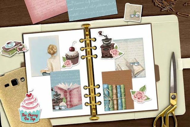
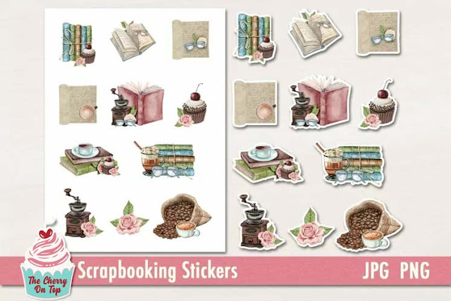
See how these vintage designs will make great printables?
Above, the white sticker aspect of the elements has been removed. Did ya know you can do that? Watch a couple videos with the lasso tool or even the magic wand. You can ditch the outline with a simple click or two. I do this a lot. Above the sticker outline is gone and below she left it.
is Kim's page not THE best page idea?! I LOVE it!
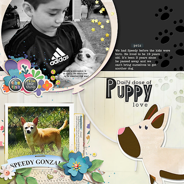
You can scrap your pets in a really fun and unique way...
or just use the adorable animals for any subject.
Have you noticed how my ladies use their shadows? I like a rather intense shadow. Other scrappers go for a more subdued shadow. It's all a matter of preference and effect. Above, Theresa use a smaller, subtle shadow for her elements.
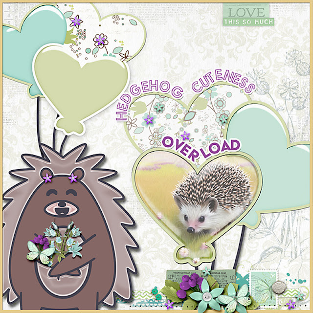
The shadow behind hedgy is my shadow. Dark, intense...it gives my little guy lift.
Did you make it all the way through?! You rock!!! This was one heck of a blog. I need a break! A long walk through the mountains should do. I'm sure I'll find all kinds of wonderful to inspire me for my next set of templates and designs.
Thanks so much for your visit. Enjoy all of the new products from this blog at a 30% discount for one week. See you at GingerScraps!
Happy scrapping!
